Welcome to
SpendSmart
Budget Better, Live Smarter

Project Description
SpendSmart is a digital application designed to transform the way students manage their expenses. By offering insights into spending patterns, personalized budget recommendations, and predictive analytics, SpendSmart aims to provide a comprehensive tool for students to manage their finances effectively. It offers a unique combination of budget management with smart shopping recommendations, ensuring students can navigate their academic and financial challenges with greater ease.

Project Context
This project was completed as part of upper-level undergraduate course in User Experience Design during Spring 2024. The course focused on developing digital solutions for real-world problems, with an emphasis on user-centered design and iterative development. The SpendSmart project was a group effort, completed over a semester, and aimed at addressing the unique budgeting needs of college and university students.

Problem Statement
Many students struggle to manage their expenses effectively due to tight budgets and a lack of personalized budgeting tools. Traditional budget management apps often do not cater to students' specific financial constraints, leading to inefficient expense management. SpendSmart addresses this gap by offering personalized features and predictive analytics designed to help students proactively manage their budgets and find cost-saving opportunities.
Target Users
SpendSmart is specifically designed for students in academic environments who face unique financial challenges. These users often require specialized tools to manage their expenses and need guidance in making informed financial decisions.

How SpendSmart Differs
What sets SpendSmart apart from other budget management apps is its combination of budget tracking, predictive analysis, and smart shopping recommendations. SpendSmart learns from a student's spending habits over time and uses this data to suggest areas for improvement, while also recommending store offers and discounts tailored to their needs. This unique approach provides a comprehensive solution for effective expense management.
Our Team

Srishti
Adkar

Yashashree
Deshpande

Krushikesh
Thotange

Navami
Bhat
Project Completion
SpendSmart was completed through a series of iterative design cycles, involving user research, prototyping, usability testing, and final implementation. The project was presented at the end of the course as a final deliverable, showcasing the comprehensive features and unique value proposition of the SpendSmart app.

Personas

Personas Analysis and Description
Our project included extensive interviews with a diverse group of individuals, aiming to extract key characteristics and commonalities to inform the design of our budget management application. From the analysis of these interviews, we distilled four primary personas and one secondary persona. These personas represent a broad spectrum of user types, encompassing various financial behaviors, budgeting strategies, and lifestyle preferences.

Personas - What , Why & How
Personas are fictional representations of users based on real data and insights gathered from user research and interviews. They help guide the design and development process by ensuring that products meet the needs of target audiences.
We created personas to focus our design efforts on real user needs and behaviors. By understanding the goals, challenges, and motivations of our target users, we can create a budget management app that resonates with them and addresses their specific pain points. Personas allow us to empathize with our users and ensure that every design decision aligns with their expectations.
Personas were developed based on extensive interviews with users, providing a foundation for understanding common characteristics and needs among our target audience. By distilling interview data into distinct personas, we could identify recurring themes and user types, enabling us to design features and experiences that cater to these personas.
The personas shaped the development of our app's features and user flows, influencing design choices for the site map and user interface. Each persona represents a different user archetype, helping us prioritize functionalities and tailor the app to their specific requirements. The personas served as a constant reference point throughout the design process, ensuring that our decisions remained user-centric.
Each persona brings unique insights into the challenges and strategies involved in budgeting and financial management. Their diverse experiences help us understand the needs of our target users and inform the design of a comprehensive budget management application.
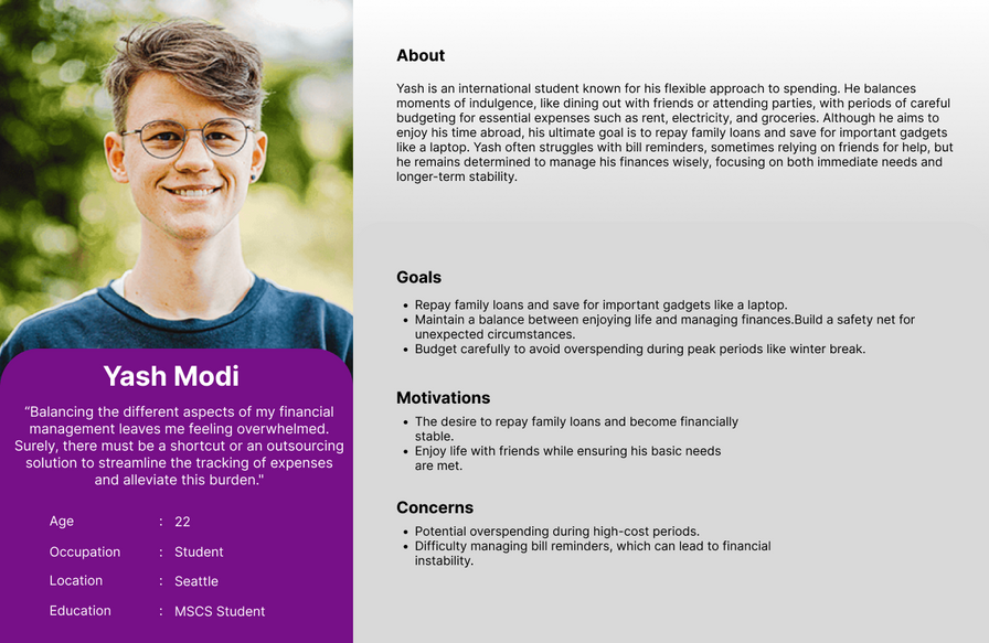
Yash
Yash, primary persona, is an international student who takes a more flexible approach to spending money. He often indulges in dining out and socializing but balances this with careful budgeting for essentials like rent and groceries. His ultimate financial goal is to repay family loans and save for necessary gadgets. Yash's budget can be disrupted by unexpected events like overspending during breaks, highlighting the need for better bill reminders and discipline in spending. Despite these challenges, he maintains a balance by relying on friends and aiming to build a safety net. Yash's persona showcases the ups and downs of budgeting for a student with a flexible mindset, emphasizing the importance of adaptability.
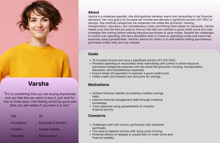
Varsha
Varsha is a primary persona who demonstrates a meticulous approach to financial management. She clearly distinguishes between wants and necessities, categorizing her expenses into specific areas like groceries, housing, transportation, and education. Her immediate financial goal is to increase her income and save 20-30% of her monthly salary. Varsha's financial discipline is reflected in her strategies to avoid impulsive purchases, maintain a good credit score, and use credit card rewards to save money. She advises others to practice self-control and use spreadsheets to visualize expenses and income. Varsha's persona underscores the importance of setting financial goals and sticking to a well-structured budget.
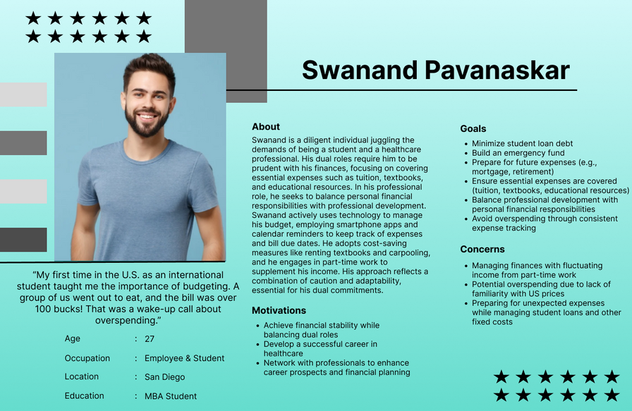
Swanand
Our secondary persona, Swanand, balances dual roles as a student and a healthcare professional. As a student, Swanand is cautious, focusing on essential expenses like tuition and textbooks. In his professional role, he balances spending on professional development with personal financial responsibilities. Swanand's financial goals include minimizing student loan debt, building an emergency fund, and preparing for future expenses like mortgages and retirement. He employs budgeting, part-time work, renting textbooks, and carpooling as strategies to manage his finances. Additionally, Swanand uses technology to set reminders and track expenses, which has significantly contributed to his financial stability.

Site Map
Overview
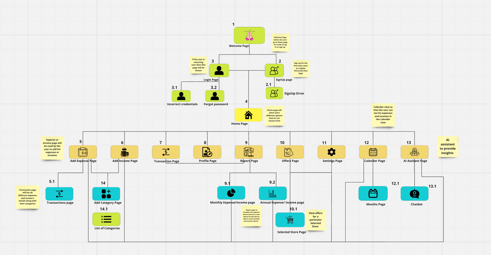
The site map is the blueprint for our budget management application, depicting the flow and connections between different pages and functionalities. It provides a comprehensive view of how users will navigate through the app, from entry points to various features and options. Below is a detailed description of the site map, outlining the structure and connections within the application.
Sitemap - What , Why & How
The site map is a blueprint of our budget management application, depicting the relationships and connections between different pages and features. It provides a visual representation of the user journey and outlines the app's basic structure and navigation.
We created the site map to visualize the application's flow and ensure seamless user navigation. The site map serves as a guide for structuring the app, helping us understand how users move from one page to another and how different features are interconnected. It allows us to identify potential bottlenecks and optimize the user experience.
The site map was developed after analyzing the personas and understanding the key functionalities needed to meet their needs. It reflects the insights gathered from user research, ensuring that the app's structure aligns with user expectations and behaviors. The site map incorporates the primary features and flows that were derived from the persona analysis.
The site map laid the groundwork for the app's detailed design and implementation. It guided the creation of wireframes, prototypes, and user interfaces, providing a clear roadmap for the development team. The site map also helped identify key interaction points and connections between features, leading to a smoother user experience. By using the site map as a reference, we could ensure consistency and coherence throughout the app's design and development stages.
Main Entry Points
- Welcome Page: The initial landing point for users. It serves as an introduction to the app and provides links to the Login and Sign-Up pages.
- Login and Sign-Up Pages: These pages allow users to access their accounts or create new ones. The Login page further provides options for resetting passwords, entering verification codes, and handling forgotten passwords.
Core Navigation
Home Page: The primary entry point after login or sign-up. This is the central hub from which users can access the various features of the application. It is connected to multiple key pages, ensuring smooth navigation throughout the app.
Main Features and Connections
- Expense Management:
- Add Expense Page: Allows users to input their expenses. It is connected to the Transactions Page for detailed tracking.
- Transactions Page: Displays all user transactions. It has a connection to the Add Category page for categorizing expenses.
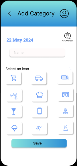
- Add Category and List of Categories: Provides users with options to create new categories or view existing ones.
- Income Management:
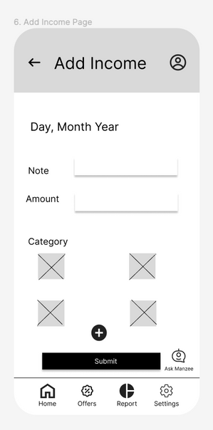
- Add Income Page: Similar to the Add Expense Page but for income. It is also connected to the Add Category page.
- Report Management:
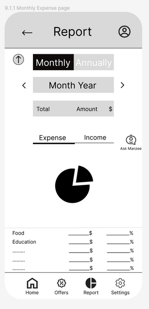
- Report Page: Gives users access to various financial reports. It connects to Monthly Expense, Annual Expense, Monthly Income, and Annual Income pages.
- Monthly and Annual Expense/Income Pages: Detailed breakdowns of users' finances, providing valuable insights into spending and income patterns.
Main Features and Connections
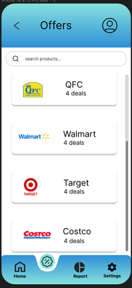
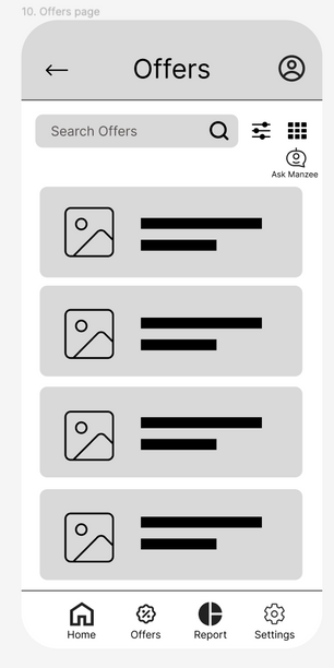
- Offers Management:
- Offers Page: Displays store offers and discounts. It is connected to a Selected Store Page where users can explore specific offers.
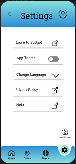
- Settings and Calendar Management:
- Settings Page: Allows users to customize their app experience.
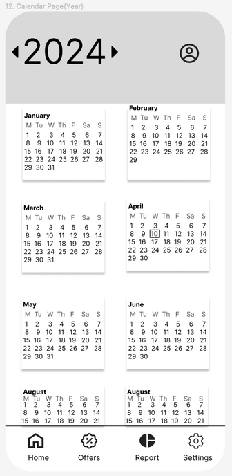
- Calendar Page: Offers a unique view of users' financial activities, helping them track expenses and income over time.
- AI Assistant Management:
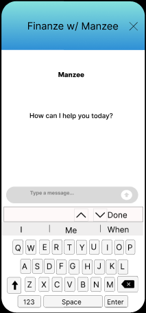
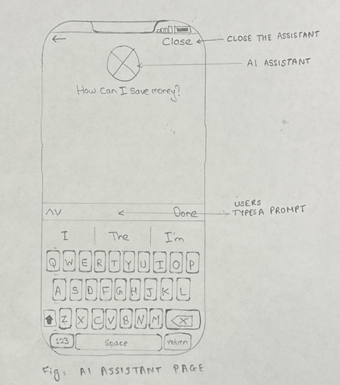
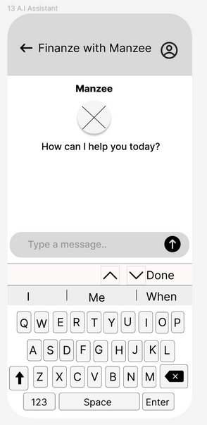
- AI Assistant Page: Provides users with AI-driven insights and suggestions for managing their finances. It is connected to the Chatbot Page, where users can interact with the AI assistant for guidance.

Sketches
Sketches - What , Why & How
The sketches for SpendSmart, our budget management app, are visual representations of the app’s interface and functionality. They include detailed depictions of various screens such as the home page, add expense page, transactions page, reports page, welcome page, sign-up/login pages, offers page, calendar page, settings page, forgot password page, AI assistant chat page, and saving goal page. These sketches serve as the foundation for the app’s design and user experience.
We created the sketches to conceptualize and plan the layout and user flow of the app before moving into more detailed prototypes. Sketches allow us to quickly visualize and iterate on ideas, ensuring that the app’s design is intuitive and meets user needs. They help in identifying potential usability issues early in the design process and provide a clear blueprint for the development of higher fidelity prototypes.
The sketches build upon the initial ideas and requirements gathered during the planning phase. This phase involved understanding user needs, defining core functionalities, and brainstorming design concepts. The sketches translate these ideas into tangible designs, laying out the structure and interaction flow of the app.
The sketches serve as a guide for creating the paper prototypes. They help in visualizing the user interface and determining the placement of elements on each screen. Based on feedback from the sketches, we refined our designs and made necessary adjustments before developing more interactive prototypes.
Changes Made and Why
- Simplification of Navigation: Initially, the sketches included multiple navigation buttons which made the home page look cluttered. We streamlined the navigation by grouping related functions together, enhancing the user experience.
- Consistent Design: The add expense and add income pages were designed similarly to maintain consistency, making it easier for users to switch between these core functions without confusion.
- Visual Representation: The reports page was initially designed with different visualizations for monthly and annual reports. Based on user feedback, we decided to use pie charts for both, but with distinct colors for expenses and income, to simplify understanding and comparison.
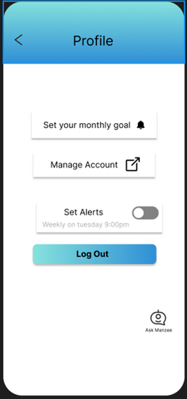
- Interactive Elements: The toggle button for setting up financial goals was changed to a bell icon based on user feedback, making it more intuitive and easier to recognize the goals set for a specific month.
Sketches
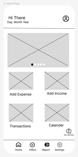
- The sketches for our budget management app, SpendSmart, reflect a comprehensive approach to financial tracking and user interaction. The home page, as the main landing point, serves as the entry to various functionalities, offering clear navigation with prominent buttons leading to key features. This page plays a central role in guiding users through the app's primary functions, allowing them to seamlessly access different sections, such as add expense, add income, transactions, profile, reports, offers, settings, calendar, and the AI assistant.
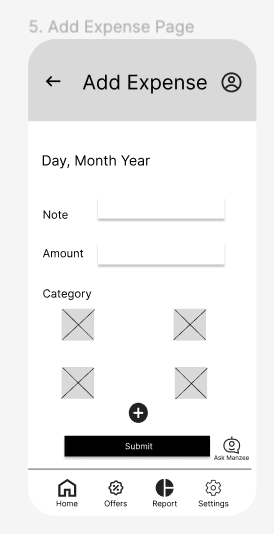
- The add expense page is designed to facilitate users in recording their daily expenses with simplicity and ease. It features an intuitive form where users can enter expense details, categorize them, and even add notes. This page complements the add income page, which follows a similar design to ensure consistency across the application. These two pages serve as the foundation for the app's core budgeting functions, allowing users to manage their finances with minimal complexity.
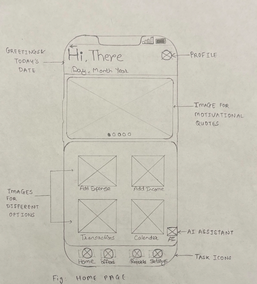
Home Page
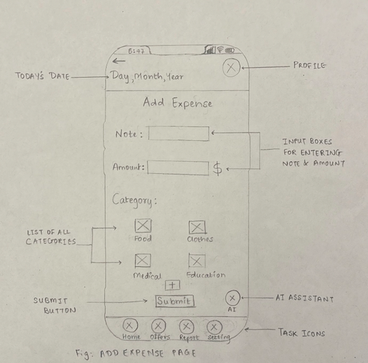
Expense Page
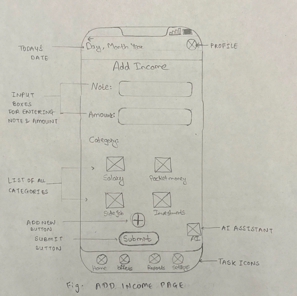
Income Page
Sketches
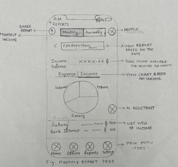
- The transactions page provides users with a comprehensive view of all their financial activities, enabling filtering by date, category, or amount. This page is essential for users who want to track their spending over time and identify trends. While it offers a wide range of information, it is designed to avoid clutter and maintain clarity. The reports page, on the other hand, offers detailed insights into monthly and annual income and expenses, providing users with visual charts and graphs to help them understand their financial patterns. This page aims to deliver valuable insights to users seeking to improve their budgeting skills.
- The welcome page sets the tone for the entire application, providing an inviting introduction and encouraging user engagement. It is crucial for user onboarding, offering a warm and straightforward entry point into the app. The sign-up page, which ensures user registration, follows a similar approach, with clear fields for user information and optional social media login options to streamline the process. The login page provides secure user access, with standard features like password recovery and "Remember Me" options, ensuring a smooth user experience.
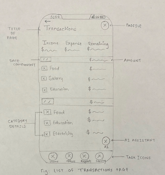
Transaction Page
Report Page
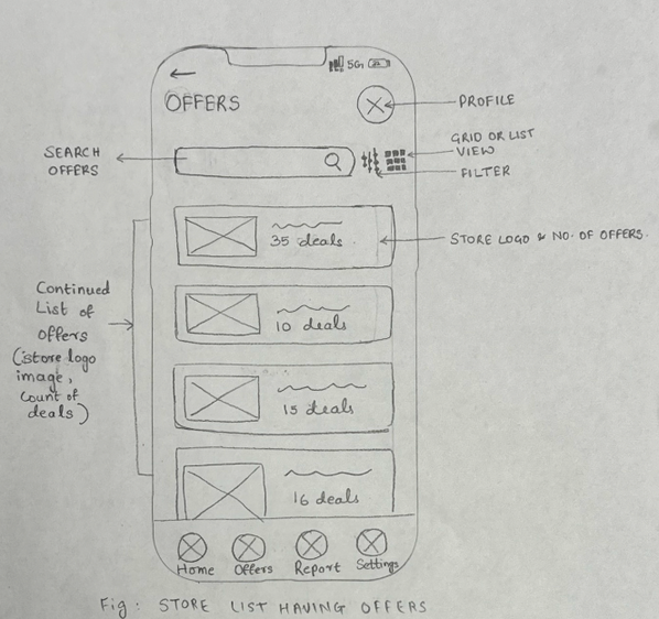
Offers Page
Sketches
- Additional sketches focus on various functionalities, such as the number of offers page, which creatively integrates external offers from supermarkets and other retailers, adding value for users. The detailed list of offers page further expands on this by providing a comprehensive list of current offers, requiring external data integration to maintain relevancy. The calendar page allows users to track expenses and income over time, offering a unique way to visualize financial activities. The settings page provides users with customization options to tailor the app to their preferences, while the forgot password page offers a simple and secure process for account recovery.
- Finally, the AI assistant chat page represents a highly innovative feature, allowing users to interact with an AI assistant for budget-related questions and advice. This page has significant potential but may require advanced AI technology and development resources. The saving goal page encourages users to set, track, and visualize their savings goals, providing an additional layer of motivation and discipline to the budgeting process.
- These sketches collectively represent the diverse range of features and functionalities within the SpendSmart app, designed to meet the unique needs of students managing their budgets. The focus on simplicity, clarity, and user engagement is evident throughout, with each page contributing to the overall user experience.
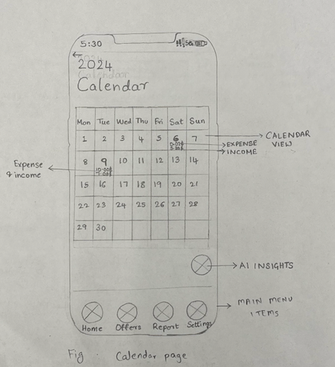
Calender Page
AI Assistant Page
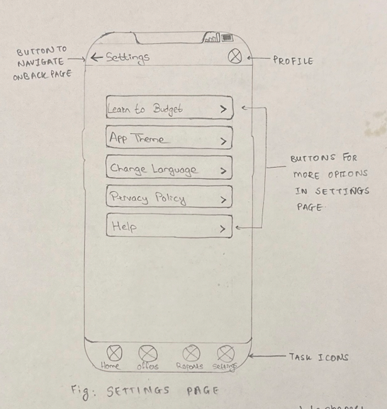
Settings Page
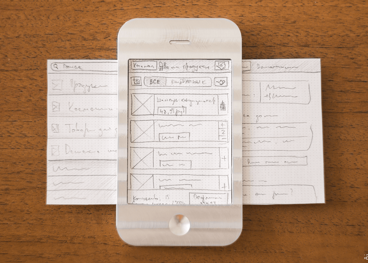
Paper Prototype
Paper Prototypes - What , Why & How
The paper prototypes are physical, low-fidelity representations of the app’s interface, created using sketches on paper. These prototypes are used to simulate the user experience and interaction with the app, allowing us to test and refine the design before developing digital versions.
We created paper prototypes to quickly test and validate the app’s design and user flow in a cost-effective manner. Paper prototypes enable us to gather user feedback early in the design process, allowing for rapid iteration and improvement based on real user interactions. This step is crucial for identifying usability issues and ensuring that the design meets user needs.
Paper Prototypes - What , Why & How
The paper prototypes are a direct extension of the initial sketches. They translate the visual and layout ideas from the sketches into a more interactive format that can be tested with users. The prototypes help us move from conceptual design to practical implementation, bridging the gap between initial ideas and functional designs.
The feedback and insights gathered from testing the paper prototypes inform the development of high-fidelity, interactive digital prototypes. These prototypes will incorporate the changes and improvements identified during the paper prototype testing, leading to a more refined and user-friendly app design.
Paper Prototype
- The development of our budget management app, SpendSmart, involved a comprehensive and iterative process. We began by brainstorming ideas for the key features of the app, focusing on functionality that would be valuable to our target users—students managing their finances. After several rounds of brainstorming, we created a series of paper prototypes to represent potential scenarios within the app. These prototypes allowed us to visualize the user journey and test different interactions.
- The primary scenarios we identified revolved around managing expenses and income, viewing reports, and exploring special offers. These scenarios form the backbone of the SpendSmart app, guiding users through a logical and intuitive flow.
Paper Prototype
- The first scenario focused on the "Add Expense" feature, which is fundamental to any budget management app. This prototype allows users to record their daily expenditures, offering categorization and the ability to add notes for specific transactions. This straightforward design emphasizes ease of use and quick data input, supporting users in maintaining an accurate record of their spending. The scenario begins with a welcome screen, leading to the home page, and ultimately guiding users to the add expense page and transaction page, creating a natural flow for expense tracking.
- The second scenario concentrated on the "Reports Page," where users could access detailed insights into their financial activities. This prototype offers various visualizations, including pie charts, bar graphs, and line charts, enabling users to view monthly and annual reports on income and expenses. This scenario demonstrates SpendSmart's ability to provide comprehensive overviews of financial patterns, helping users make informed decisions about their budgets. The scenario follows a logical path from the home page to the monthly expense and income reports, with options to view annual summaries, allowing users to explore their financial data in depth.
- The third scenario centers on the "Offers Page," a unique feature that showcases special offers and discounts from various partners and merchants. This prototype allows users to browse through different offers and select those that suit their needs, offering an innovative approach to incorporating partnerships into a budget management app. This scenario demonstrates how SpendSmart can provide additional value to users by helping them save money through exclusive offers. The journey in this scenario begins from the home page, leading to the offers page and then to detailed information about specific offers, encouraging users to take advantage of these discounts.
- Throughout this process, we refined our sketches and scenarios based on user feedback and internal discussions. We focused on ensuring that the app's core functionalities were intuitive, user-friendly, and engaging. The overall goal was to create an app that not only helps students manage their budgets but also provides them with insights, visualizations, and unique opportunities to save money.
- By creating these paper prototypes and refining the scenarios, we were able to visualize the user's journey through SpendSmart and identify areas for improvement. This approach allowed us to address potential weaknesses, enhance user engagement, and ensure a smooth flow through the app's features. Each scenario provided valuable insights into the user's experience, guiding the development of SpendSmart and ultimately contributing to a successful budget management solution for students.
Wireframes
Wireframes - What , Why & How
The wireframes for SpendSmart represent the detailed structural layout of the app’s user interface without the distraction of colors, fonts, or other design elements. These wireframes outline the functional components and navigation paths within the app, providing a clear blueprint for how the app's features are organized and how users will interact with them.
We created wireframes to serve as a visual guide for the development team, ensuring that every element of the app's interface is strategically placed and logically organized. Wireframes help in mapping out the user journey, identifying potential usability issues, and facilitating discussions about functionality before moving on to more detailed visual design and interactive prototyping. They act as an intermediary step between sketches and high-fidelity prototypes, allowing for iterative refinement based on feedback.
Wireframes - What , Why & How
The wireframes build directly upon the sketches and paper prototypes, incorporating the initial design ideas and user flows into a more detailed and structured format. This progression allows for a more precise representation of the app’s functionality, ensuring that the core elements identified during the earlier stages are effectively translated into a coherent and user-friendly interface.
The wireframes serve as a foundation for the high-fidelity prototypes, providing a detailed layout that designers can embellish with visual styles and interactive elements. The wireframes guide the creation of the interactive prototype, ensuring that the visual design aligns with the planned user experience and functionality.
Changes Made and Why
- Clutter Reduction: Based on heuristic evaluation feedback, we reduced the number of categories on the home page from five to four, and placed the 'add category' button in a less prominent position. This change helped declutter the interface and simplify navigation.
- Visualization Consistency: Initially, we planned different visualizations for monthly and annual reports (pie chart for monthly, bar chart for annual). To maintain visual consistency and ease of interpretation, we decided to use pie charts for both, with distinct colors for expenses and income.
- Goal Setting Icon: The toggle button for setting financial goals was unclear to users. We replaced it with a bell icon, making it more intuitive for users to recognize and use the goal-setting feature.
- Login Page Adjustments: The login page was initially cluttered. We moved the username and password fields upwards to create a more open layout and labeled the welcome page as “Welcome” instead of “Welcome Back” to better accommodate first-time users, enhancing the onboarding experience.
- AI Assistant Naming: The AI button was not clearly understood by users. We re-labeled it as “ASK MANZEE” to clearly indicate its purpose as an AI assistant, improving user comprehension and interaction.
The wireframes for our budget management app, SpendSmart, highlight the main features designed to enhance user interaction and financial management. Key functionalities include the ability to easily add expenses and income, enabling users to keep a precise record of their financial activities. The view reports feature offers detailed insights into both monthly and annual expenses and income, using clear visualizations to help users track and analyze their financial patterns.
Additionally, the app includes a dedicated section for viewing offers in specific stores, providing users with opportunities to save money through relevant discounts and promotions. These features collectively ensure that SpendSmart provides a comprehensive, user-friendly tool for effective budget management.
Home Page
Expense Page
Income Page
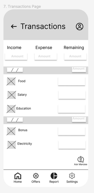
Transaction Page
High fidelity Prototype
High Fidelity Prototypes - What , Why & How
The high-fidelity prototype for SpendSmart represents the final, polished version of the app’s user interface. This prototype includes detailed design elements such as colors, fonts, and interactive components, providing a realistic representation of the app's appearance and behavior. It serves as a comprehensive visual and interactive guide, showcasing how users will navigate and interact with the app’s features.
We created the high-fidelity prototype to provide a clear and detailed representation of the final product. This prototype allows for thorough testing of the app's usability and functionality, ensuring that all design elements work together cohesively. It helps stakeholders visualize the end product, facilitates user testing to gather final feedback, and serves as a precise reference for developers during the coding phase.
High Fidelity Prototypes - What , Why & How
The high-fidelity prototype builds on the wireframes, incorporating the structural layout and functional components into a visually rich and interactive format. This stage translates the detailed plans from the wireframes into a complete design, adding aesthetic elements and interactive features. The prototype reflects all the feedback and refinements made during the wireframing stage, ensuring a seamless transition from a basic layout to a fully developed interface.
The high-fidelity prototype serves as the final step before development, providing a detailed and interactive model for the development team to follow. It ensures that the design intentions are clear.
Changes Made and Why
- Simplification of Categories:
- Low-Fidelity Prototype: The initial design included four categories with an additional "Add Category" button, which made the interface appear cluttered.
- Interactive Prototype: We streamlined the interface by removing one category and placing the "Add Category" button in its place. This change enhanced the overall layout, making it cleaner and more user-friendly.
- Visualization Consistency:
- Low-Fidelity Prototype: We specified different visualizations for monthly and annual reports; a pie chart for the monthly report and a bar chart for the annual report.
- Interactive Prototype: In the high-fidelity design, we standardized the visualizations by using pie charts exclusively. We also differentiated expenses and income with distinct colors, enhancing clarity and consistency across reports.
- Goal Setting Icon:
- Low-Fidelity Prototype: A toggle button was used for setting up financial goals.
- Interactive Prototype: We replaced the toggle button with a bell icon, which indicates the month for which the goal is set. This change made the goal-setting feature more intuitive and visually distinct.
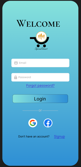
Login Page
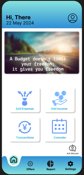
Home Page
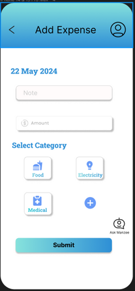
Add Expense
Page
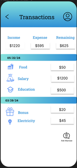
Transactions
Page
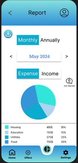
Report
Page